
HTML / CSS / 系统课时
设置网格对齐
设置网格对齐
Grid 对齐分为两个层级:一是网格项目在各自网格区域中的位置,二是整组网格轨道在容器剩余空间中的位置。本课通过两组类名和一个可运行示例,帮助你准确选择 items-*、justify-items-*、content-* 与 justify-*。
学习目标
- 区分“项目对齐”和“网格整体对齐”两种控制范围
- 使用单轴与双轴工具类设置常见对齐方式
- 通过容器尺寸和固定轨道验证对齐是否真正生效
区分两层对齐
项目对齐发生在单个网格区域内部。某个单元格比项目本身更大时,justify-items-* 控制水平方向,items-* 控制垂直方向,place-items-* 可以同时设置两条轴。它们不会移动网格轨道,只会改变项目在各自区域中的落点。
网格整体对齐作用于整组轨道。只有轨道总尺寸小于容器,出现额外空间时,justify-*、content-* 与 place-content-* 才能看出效果。若列宽使用 1fr 并铺满容器,即使设置整体对齐,视觉上也可能没有变化。
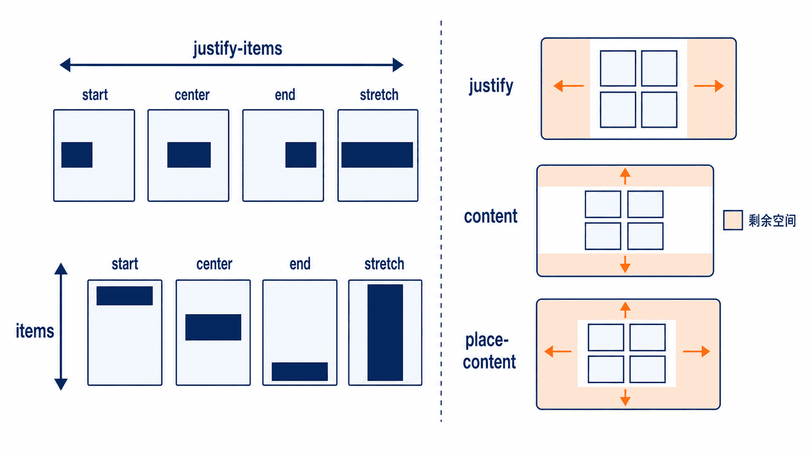
选择项目对齐类
justify-items-start、justify-items-center、justify-items-end 与 justify-items-stretch 控制项目在行内轴上的位置;items-start、items-center、items-end 与 items-stretch 控制块轴。需要同时设置两条轴时,优先使用 place-items-center 等组合类,减少重复并让意图更明确。
单个项目需要覆盖容器默认规则时,使用 justify-self-*、self-* 或 place-self-*。例如容器统一居中后,可给某个项目添加 place-self-end,让它单独贴近网格区域的右下角。
选择网格整体对齐类
justify-start、justify-center、justify-end 等类控制整组列轨道的水平位置,content-start、content-center、content-end 等类控制整组行轨道的垂直位置。place-content-center 会同时把两条轴上的轨道组居中。
使用这组类前,应同时检查容器和轨道尺寸:容器需要有明确的宽度或高度,轨道也不能自动铺满全部空间。固定列宽、固定行高或内容尺寸轨道更适合观察整体对齐效果。
完整示例与验证
下面的页面包含两个等高容器。左侧把轨道组放在左上角,并让项目拉伸;右侧把轨道组与项目都居中。保存为 index.html 后直接用浏览器打开,需要联网加载 Tailwind 浏览器脚本。
<!doctype html>
<html lang="zh-CN">
<head>
  <meta charset="UTF-8" />
  <meta name="viewport" content="width=device-width, initial-scale=1.0" />
  <title>设置网格对齐</title>
  <script src="https://cdn.jsdelivr.net/npm/@tailwindcss/browser@4"></script>
</head>
<body class="bg-slate-100 p-8">
  <main class="mx-auto grid max-w-5xl gap-6 md:grid-cols-2">
    <!-- 固定轨道小于容器,才能观察整体对齐 -->
    <section class="grid h-72 grid-cols-[7rem_7rem] grid-rows-[5rem_5rem] content-start justify-start gap-4 border-2 border-dashed border-sky-500 bg-white p-4">
      <div class="grid place-items-center rounded-lg bg-sky-600 font-bold text-white">1</div>
      <div class="grid place-items-center rounded-lg bg-sky-600 font-bold text-white">2</div>
      <div class="grid place-items-center rounded-lg bg-sky-600 font-bold text-white">3</div>
      <div class="grid place-items-center rounded-lg bg-sky-600 font-bold text-white">4</div>
    </section>
    <!-- place-content 移动轨道组,place-items 移动单元格内的项目 -->
    <section class="grid h-72 grid-cols-[7rem_7rem] grid-rows-[5rem_5rem] place-content-center place-items-center gap-4 border-2 border-dashed border-orange-500 bg-white p-4">
      <div class="grid size-12 place-items-center rounded-lg bg-orange-500 font-bold text-white">1</div>
      <div class="grid size-12 place-items-center rounded-lg bg-orange-500 font-bold text-white">2</div>
      <div class="grid size-12 place-items-center rounded-lg bg-orange-500 font-bold text-white">3</div>
      <div class="grid size-12 place-items-center rounded-lg bg-orange-500 font-bold text-white">4</div>
    </section>
  </main>
</body>
</html>
预期结果
页面显示两个并排网格容器:左侧轨道组位于左上角,项目填满各自网格区域;右侧轨道组位于容器中央,四个较小项目也在各自单元格内居中。窄屏时两个容器自动改为上下排列。