
Web 图形与 3D / 系统课时
适配 Canvas 尺寸与设备像素比
适配 Canvas 尺寸与设备像素比
让 WebGPU 画布跟随容器宽高变化,并按设备像素比更新实际绘图分辨率。完成后,三角形在高分屏上不会因低分辨率画布被放大而模糊,调整窗口宽度时也能自动重绘,无需刷新页面。
学习目标
- 区分 Canvas 的 CSS 显示尺寸与绘图缓冲像素尺寸。
- 使用
ResizeObserver和 DPR 同步绘图缓冲,并重新提交一帧。 - 验证高清显示、窗口缩放及纹理尺寸上限的处理结果。
CSS 尺寸与绘图像素
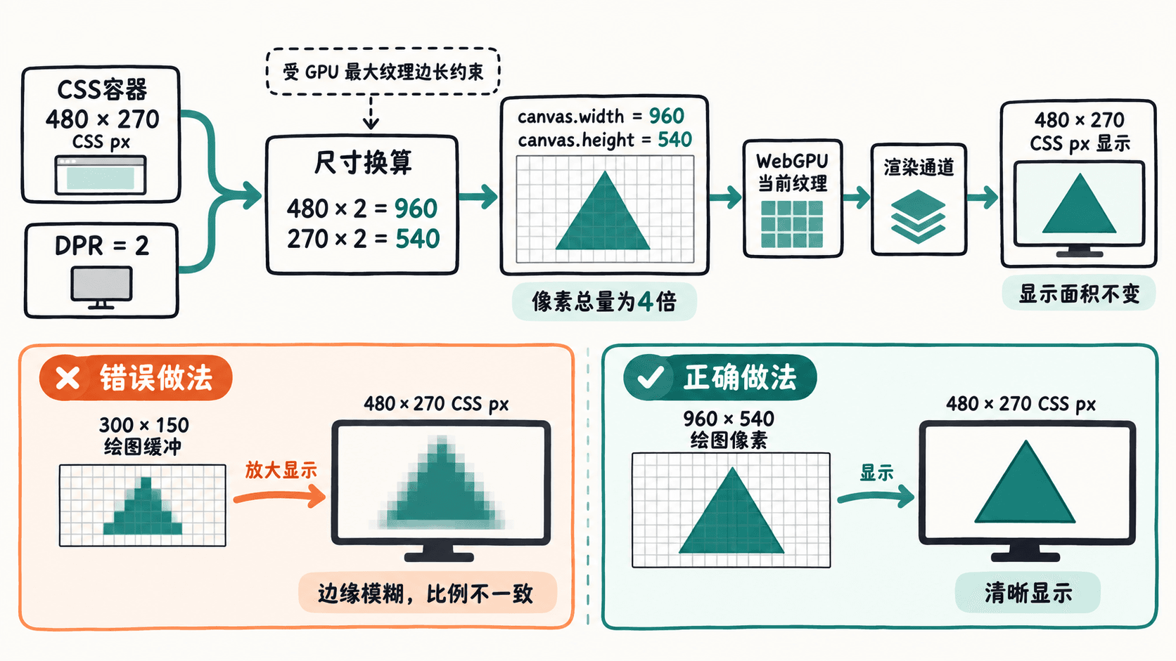
Canvas 有两套大小:CSS 的 width、height 决定页面占用的空间;元素属性 canvas.width、canvas.height 决定 WebGPU 当前画布纹理的像素数。只修改 CSS 不会自动增加绘图像素,浏览器可能把低分辨率结果放大显示。
例如,容器宽 480、高 270 个 CSS 像素,devicePixelRatio = 2,理想绘图缓冲为 960×540 像素,显示区域仍是 480×270。两轴都乘 2,像素总数会变成原来的 4 倍。默认 Canvas 缓冲为 300×150,因此直接拉伸到 480×270 不仅可能模糊,还会改变图像比例。
监听容器并重绘
将以下完整示例保存为 index.html。容器的 aspect-ratio: 16 / 9 保持可见三角形的宽高比例;Canvas 通过 width: 100%、height: 100% 占满容器,绘图缓冲则由 JavaScript 单独设置。需要支持 WebGPU 的浏览器,并通过 localhost 或 HTTPS 访问。
<!doctype html>
<html lang="zh-CN">
<meta charset="utf-8">
<title>WebGPU Canvas 自适应</title>
<style>
  body { margin: 0; }
  #stage { width: min(90vw, 480px); aspect-ratio: 16 / 9; margin: 24px auto; }
  canvas { display: block; width: 100%; height: 100%; }
  #info { text-align: center; font: 14px sans-serif; }
</style>
<div id="stage"><canvas id="gpu"></canvas></div>
<p id="info"></p>
<script type="module">
const canvas = document.querySelector('#gpu');
const info = document.querySelector('#info');
if (!navigator.gpu) throw new Error('浏览器不支持 WebGPU');
const adapter = await navigator.gpu.requestAdapter();
if (!adapter) throw new Error('未找到可用 GPUAdapter');
const device = await adapter.requestDevice();
const context = canvas.getContext('webgpu');
if (!context) throw new Error('无法获取 GPUCanvasContext');
const format = navigator.gpu.getPreferredCanvasFormat();
context.configure({ device, format, alphaMode: 'opaque' });

const shader = device.createShaderModule({ code: `
  @vertex fn vs(@builtin(vertex_index) i: u32) -> @builtin(position) vec4f {
    let p = array<vec2f, 3>(
      vec2f(-0.65, -0.60), vec2f(0.65, -0.60), vec2f(0.0, 0.60)
    );
    return vec4f(p[i], 0.0, 1.0);
  }
  @fragment fn fs() -> @location(0) vec4f {
    return vec4f(0.05, 0.70, 0.61, 1.0);
  }
` });
const pipeline = device.createRenderPipeline({
  layout: 'auto',
  vertex: { module: shader, entryPoint: 'vs' },
  fragment: { module: shader, entryPoint: 'fs', targets: [{ format }] },
  primitive: { topology: 'triangle-list' }
});

function draw() {
  const encoder = device.createCommandEncoder();
  // 缩放后重新获取当前纹理,不能缓存旧的颜色附件视图。
  const pass = encoder.beginRenderPass({ colorAttachments: [{
    view: context.getCurrentTexture().createView(),
    clearValue: { r: 1, g: 1, b: 1, a: 1 },
    loadOp: 'clear', storeOp: 'store'
  }] });
  pass.setPipeline(pipeline);
  pass.draw(3);
  pass.end();
  device.queue.submit([encoder.finish()]);
}

let scheduled = false;
function scheduleDraw() {
  if (scheduled) return;
  scheduled = true;
  requestAnimationFrame(() => { scheduled = false; draw(); });
}
function setBufferSize(pixelWidth, pixelHeight) {
  const limit = device.limits.maxTextureDimension2D;
  // 超过硬件上限时等比缩小,且避免出现 0 像素纹理。
  const scale = Math.min(1, limit / Math.max(pixelWidth, pixelHeight, 1));
  const w = Math.max(1, Math.round(pixelWidth * scale));
  const h = Math.max(1, Math.round(pixelHeight * scale));
  if (canvas.width !== w || canvas.height !== h) {
    canvas.width = w;
    canvas.height = h;
    scheduleDraw();
  }
  info.textContent = `显示 ${canvas.clientWidth}×${canvas.clientHeight} CSS px;`
    + `绘图 ${w}×${h} px;DPR ${window.devicePixelRatio}`;
}

let hasExactPixelSize = false;
const observer = new ResizeObserver(([entry]) => {
  const physical = entry.devicePixelContentBoxSize?.[0];
  const css = entry.contentBoxSize[0];
  hasExactPixelSize = Boolean(physical);
  // 已获取真实设备像素时,绝不能再乘一次 DPR。
  const dpr = window.devicePixelRatio || 1;
  setBufferSize(physical?.inlineSize ?? css.inlineSize * dpr,
                physical?.blockSize ?? css.blockSize * dpr);
});
try { observer.observe(canvas, { box: 'device-pixel-content-box' }); }
catch { observer.observe(canvas); }
window.addEventListener('resize', () => {
  if (hasExactPixelSize) return;
  const rect = canvas.getBoundingClientRect();
  const dpr = window.devicePixelRatio || 1;
  setBufferSize(rect.width * dpr, rect.height * dpr);
});
</script>
</html>
预期结果:页面出现白底青绿色三角形及一行尺寸数据。在显示宽 480、高 270 个 CSS 像素、DPR 为 2 的环境中,数据应接近“显示 480×270 CSS px;绘图 960×540 px;DPR 2”;实际取值取决于窗口宽度、缩放和像素取整。
运行与检查
在保存 index.html 的目录执行以下命令(需要 Python 3):
python3 -m http.server 8000预期结果:终端启动本地 HTTP 服务,在浏览器打开 http://localhost:8000/index.html,可以看到三角形。服务命令会持续运行,停止时按 Ctrl+C;若 8000 端口被占用,可更换端口并同步修改访问地址。
在开发者工具中把 #stage 的宽度改为 320px,其高度会因 16:9 比例变为 180px。若 DPR 为 2,绘图缓冲应变为约 640×360;把宽度改回 480px 则恢复约 960×540。观察文字数据和边缘清晰度,确认改变的是绘图像素,而非仅拉伸已有图像。
易错边界与性能取舍
每次调整 canvas.width 或 canvas.height 都要在新的尺寸上重新绘制;本例仅在尺寸实际变化时提交一帧。context.configure() 无需因普通 Canvas 尺寸变化而反复调用,绘制时调用 getCurrentTexture() 就会取得当前尺寸的纹理。如果自己的管线还设置了 setViewport() 或 setScissorRect(),也要同步更新宽高。
本例用固定 16:9 容器确保三角形外观比例不变。若项目允许容器任意改变宽高比,虽然缓冲分辨率已正确同步,基于 NDC 的几何图形仍会随画布比例改变视觉形状;需要进一步在顶点变换或投影矩阵中补偿宽高比。