UI 视觉设计 / 系统课时
建立设计变体到 Props 的映射
建立设计变体到 Props 的映射
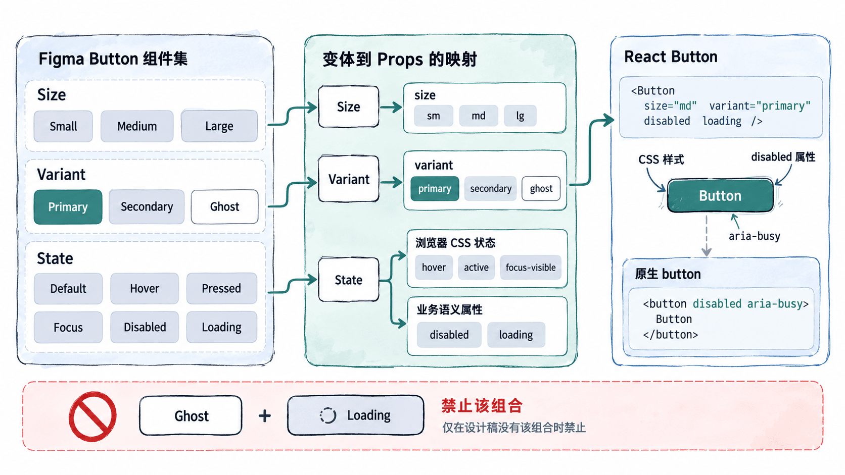
Figma 中一个 Button 往往同时有 Size、Variant、State 三组变体。若把它们全部照搬为 React 属性,业务代码就可能手动设置 Hover 或 Pressed,甚至组合出设计库不存在的状态。这里用一个按钮案例整理映射契约,并实现能在编译期拦截无效组合的 TypeScript API。
学习目标
- 区分设计选项、交互状态与业务状态,决定哪些需要对外暴露为 Props。
- 使用字符串联合类型与互斥规则表达按钮的合法组合。
- 在 React 中运行按钮并检查样式、交互、禁用与类型约束。
从 Figma 变体表提取有效 API
假设设计侧 Button 组件集有三组属性:Size = Small / Medium / Large、Variant = Primary / Secondary / Ghost,以及 State = Default / Hover / Pressed / Focus / Disabled / Loading。先逐项确认它在运行时由谁控制,而不是按 Figma 属性名自动生成同名 Prop。
| 设计项 | React 对应项 | 处理原则 |
|---|---|---|
Size |
size?: 'sm' | 'md' | 'lg' |
调用方明确选择,默认 md |
Variant |
variant?: 'primary' | 'secondary' | 'ghost' |
调用方选择视觉语义,默认 primary |
Default / Hover / Pressed / Focus |
不暴露 state |
由 CSS :hover、:active、:focus-visible 与浏览器事件驱动 |
Disabled |
disabled?: boolean |
映射到原生 <button disabled> |
Loading |
loading?: boolean |
业务请求控制,同时禁用重复点击 |
文本属性 Label |
children |
由 React 提供按钮可读名称 |
示例中三档按钮高度分别为 32、40、48px,这是本案例的验收数值,不是 Figma 的固定规则;实际项目应由设计库测量结果替换。尤其不要把 State='Hover' 做成让调用方维护的字符串,否则鼠标已离开但组件仍可能显示悬停态。
用类型封住没有设计稿的组合
示例设计规范只提供 Primary 和 Secondary 的 Loading 外观,Ghost 没有 Loading。可以把 variant 作为判别属性,用 TypeScript 联合类型规定:primary、secondary 允许 loading,ghost 不允许 loading。如果团队后来补齐 Ghost 的加载态,再同步调整类型与样式。
原生按钮已有 onClick、type、disabled、aria-label 等能力,可以通过 ButtonHTMLAttributes<HTMLButtonElement> 继承,不必另造 onPress 或 isDisabled。移除原生属性中潜在的 size 名称冲突,把对外的 size 严格限定为设计系统的三个值。
在 React 中实现映射
使用 React + TypeScript 的 Vite 模板进行演示。根据 Vite 官方指南,建议使用满足当前要求的 Node.js 22.12+;在终端执行:
npm create vite@latest figma-button-demo -- --template react-ts
cd figma-button-demo
npm install
预期结果:生成 src/App.tsx 等模板文件,依赖安装成功;初始化和安装日志随版本变化。
将 src/App.tsx 整体替换为以下可运行代码。它保留原生点击事件,默认按钮类型为 button,并让 loading 统一决定可交互性与 aria-busy 标记。
import type { ButtonHTMLAttributes, ReactNode } from 'react'
import './Button.css'

type Size = 'sm' | 'md' | 'lg'
type BaseProps = Omit<ButtonHTMLAttributes<HTMLButtonElement>, 'size'> & {
  size?: Size
  children: ReactNode
}

// 没有 Ghost 加载态设计时,在类型层拒绝该组合。
type ButtonProps = BaseProps & (
  | { variant?: 'primary' | 'secondary'; loading?: boolean }
  | { variant: 'ghost'; loading?: never }
)

function Button({
  size = 'md',
  variant = 'primary',
  loading = false,
  disabled = false,
  className = '',
  children,
  ...rest
}: ButtonProps) {
  return (
    <button
      {...rest}
      type={rest.type ?? 'button'}
      disabled={disabled || loading}
      aria-busy={loading || undefined}
      className={`button button--${size} button--${variant} ${className}`.trim()}
    >
      {loading ? '处理中…' : children}
    </button>
  )
}

export default function App() {
  return (
    <main className="demo">
      <h1>Button Props 映射</h1>
      <div className="demo__row">
        <Button size="sm" onClick={() => window.alert('保存成功')}>保存</Button>
        <Button variant="secondary" loading>提交</Button>
        <Button variant="ghost">取消</Button>
        <Button size="lg" disabled>暂不可用</Button>
      </div>
    </main>
  )
}
预期页面效果:显示一排按钮,分别为小号蓝色“保存”、灰色“处理中…”、透明背景“取消”及大号禁用“暂不可用”;点击“保存”弹出“保存成功”。
新建 src/Button.css。视觉属性由 Size、Variant 决定,瞬时交互态交给 CSS 伪类,业务不需要维护 hovered 或 pressed Prop。
.demo { min-height: 100vh; padding: 28px; box-sizing: border-box; background: #fff; color: #0f172a; }
.demo__row { display: flex; align-items: center; flex-wrap: wrap; gap: 12px; }
.button { border: 1px solid transparent; border-radius: 8px; font: 600 14px/1 system-ui; cursor: pointer; }
.button--sm { height: 32px; padding: 0 12px; font-size: 12px; }
.button--md { height: 40px; padding: 0 16px; font-size: 14px; }
.button--lg { height: 48px; padding: 0 20px; font-size: 16px; }
.button--primary { background: #2563eb; color: #fff; }
.button--secondary { background: #e2e8f0; color: #0f172a; }
.button--ghost { background: transparent; color: #1d4ed8; }
.button:not(:disabled):hover { filter: brightness(0.94); }
.button:not(:disabled):active { transform: translateY(1px); }
.button:focus-visible { outline: 3px solid #93c5fd; outline-offset: 2px; }
.button:disabled { opacity: 0.55; cursor: not-allowed; }
预期结果:样式生效后,鼠标悬停会变暗,按下时下移 1px,键盘 Tab 聚焦出现蓝色轮廓;disabled 和 loading 状态不会触发点击。上述交互参数用于演示,正式组件应对照设计规范与 Token 替换硬编码颜色。
运行并验收类型边界
在项目根目录启动开发服务:
npm run dev预期终端会显示本地访问地址:
Local: http://localhost:<PORT>/其中 <PORT> 为实际监听端口,可能不是 5173。打开该地址后检查四项:小号高度 32px;未设 size 的 Secondary 高度 40px;加载按钮不可点击;使用键盘 Tab 时可见聚焦轮廓。
最后在 App 内尝试暂时加入 variant="ghost" 且 loading 为 true 的 Button 调用,执行 npm run build:TypeScript 应拒绝该组合;删除错误调用后构建应通过。若项目确实需要 Ghost 加载态,应先补设计,再开放类型分支,而不是使用 as any 绕过契约。