
Vue / 系统课时
实现主题切换
实现主题切换
本课完成一个可复用的明暗主题方案:用 CSS 变量统一颜色,用 Pinia 保存当前主题,并把偏好写入浏览器存储。完成后,用户切换主题时页面立即更新,刷新或重新打开应用后仍能恢复上一次选择。
学习目标
- 使用 CSS 变量建立可切换的主题令牌
- 通过 Pinia 同步主题状态与根节点属性
- 持久化主题偏好并验证恢复行为
设计主题切换链路
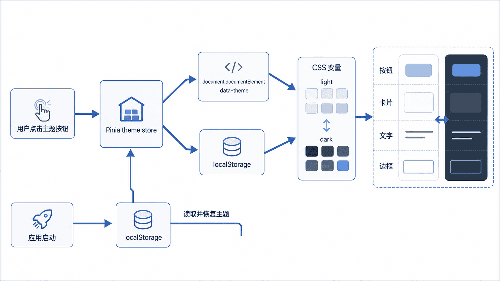
主题不应由每个组件分别判断。更稳定的做法是让应用状态只维护 light 或 dark,再把结果写到根节点的 data-theme 属性。CSS 根据该属性替换变量值,业务组件始终只消费变量。
定义主题变量
将颜色、背景、边框和阴影抽象为语义变量,组件不要直接写死十六进制颜色。以下文件可放在 src/styles/theme.css,并在应用入口中全局引入。
:root,
:root[data-theme='light'] {
  color-scheme: light;
  --color-bg: #f5f7fa;
  --color-surface: #ffffff;
  --color-text: #1f2329;
  --color-text-secondary: #646a73;
  --color-border: #dfe3e8;
  --shadow-card: 0 8px 24px rgb(31 35 41 / 8%);
}

:root[data-theme='dark'] {
  color-scheme: dark;
  --color-bg: #111318;
  --color-surface: #1b1f27;
  --color-text: #f2f3f5;
  --color-text-secondary: #a8adb7;
  --color-border: #343a46;
  --shadow-card: 0 8px 24px rgb(0 0 0 / 28%);
}

body {
  margin: 0;
  color: var(--color-text);
  background: var(--color-bg);
}

.dashboard-card {
  background: var(--color-surface);
  border: 1px solid var(--color-border);
  box-shadow: var(--shadow-card);
}
这段样式本身不负责决定主题,只定义两组可替换的设计令牌。组件继续使用同一组变量名,因此切换时不需要重新计算每个组件的样式。
创建主题状态
下面的 Store 负责三件事:读取初始偏好、更新根节点、写入 localStorage。这是片段示例,依赖项目已经安装并注册 Pinia。
// src/stores/theme.ts
import { defineStore } from 'pinia'
import { ref } from 'vue'

type Theme = 'light' | 'dark'
const STORAGE_KEY = 'admin-theme'

function getInitialTheme(): Theme {
  const saved = localStorage.getItem(STORAGE_KEY)
  if (saved === 'light' || saved === 'dark') {
    return saved
  }

  return window.matchMedia('(prefers-color-scheme: dark)').matches
    ? 'dark'
    : 'light'
}

export const useThemeStore = defineStore('theme', () => {
  const theme = ref<Theme>(getInitialTheme())

  function applyTheme(nextTheme: Theme) {
    theme.value = nextTheme
    document.documentElement.dataset.theme = nextTheme
    localStorage.setItem(STORAGE_KEY, nextTheme)
  }

  function initTheme() {
    applyTheme(theme.value)
  }

  function toggleTheme() {
    applyTheme(theme.value === 'light' ? 'dark' : 'light')
  }

  return { theme, initTheme, toggleTheme }
})
getInitialTheme 只接受两个合法值,避免存储中的异常字符串污染状态。没有历史偏好时,再回退到操作系统的配色设置。
接入应用并验证
在根组件初始化主题,并提供切换按钮。按钮展示当前状态,同时用 aria-pressed 表达是否处于深色模式。
<!-- src/App.vue -->
<script setup lang="ts">
import '@/styles/theme.css'
import { useThemeStore } from '@/stores/theme'

const themeStore = useThemeStore()
themeStore.initTheme()
</script>

<template>
  <button
    type="button"
    :aria-pressed="themeStore.theme === 'dark'"
    @click="themeStore.toggleTheme"
  >
    当前主题:{{ themeStore.theme === 'dark' ? '深色' : '浅色' }}
  </button>

  <RouterView />
</template>
预期结果
首次进入:使用已保存主题;没有保存值时跟随系统配色
点击按钮:html 的 data-theme 在 light 与 dark 之间切换
刷新页面:localStorage 中的 admin-theme 被读取,主题保持不变
浏览器开发者工具中应能看到根节点类似 <html data-theme="dark">,并在存储面板中看到 admin-theme。实际主题值会随用户操作变化。
处理边界问题
主题变量要覆盖背景、文字、边框、悬浮态和图表颜色,不能只修改页面底色。第三方组件库若支持主题令牌,应在同一个 Store 中同步其主题配置,避免页面出现一半明、一半暗。
如果希望实时跟随系统主题,应额外监听 matchMedia 的 change 事件,并区分“用户明确选择”和“跟随系统”两种模式。本课只保存明确的明暗选择,逻辑更容易验证。