UI 视觉设计 / 系统课时
用 Storybook 检查主题切换
用 Storybook 检查主题切换
把按钮的主次样式与禁用状态放进 Storybook,接入应用实际使用的语义 Token,再用工具栏切换 Light/Dark。完成后可以复现六组验收状态,并从浏览器计算样式确认颜色确实来自主题变量,而非组件中的固定色值。
学习目标
- 在 Storybook 中配置与应用一致的
data-theme主题切换。 - 用 Story 展示 Primary、Secondary、Disabled 状态,并通过 Controls 调整参数。
- 核对两种主题下的 Token 解析值,排查切换无效或样式覆盖问题。
准备 Storybook 与 Themes 插件
以下示例适用于 Storybook 10.x、React + Vite、TypeScript 项目,假设项目已能运行 React。先确认 Node.js 20+、npm 10+,在项目根目录执行;第一条完成交互式初始化后再执行第二条。
# 在现有 React + Vite 项目中初始化
npm create storybook@latest
# 初始化结束后安装主题插件
npm install -D @storybook/addon-themes
预期结果:项目生成 .storybook 配置目录,package.json 增加 storybook 脚本,并安装 Themes 插件。若已有 Storybook,只执行第二条。初始化向导可选择 Minimal;已有项目的其他插件配置不要删除。
将 .storybook/main.ts 设为以下最小完整配置;若已有 addons,只需在原数组追加主题插件:
import type { StorybookConfig } from '@storybook/react-vite';

const config: StorybookConfig = {
  stories: ['../src/**/*.stories.@(ts|tsx)'],
  addons: ['@storybook/addon-themes'], // 已有插件需保留在同一数组
  framework: '@storybook/react-vite',
};

export default config;
这里仅注册插件,还不会自动改变业务组件的颜色;必须让预览区加载 Token CSS,并把工具栏状态映射到 DOM 属性。
将语义 Token 接入主题预览
新建 src/tokens.css。下例的色值是可复现的验收样例;实际项目应直接导入 Token 编译产物,避免 Storybook 维护第二份色表。
/* Light 是兜底值,Dark 仅覆盖相同语义名称。 */
:root,
[data-theme='light'] {
  --color-surface-default: #ffffff;
  --color-text-primary: #101828;
  --color-action-primary: #155eef;
  --color-action-on-primary: #ffffff;
  --color-action-secondary: #eef4ff;
  --color-action-on-secondary: #1d2939;
  --color-action-disabled: #a3adc2;
}

[data-theme='dark'] {
  --color-surface-default: #101828;
  --color-text-primary: #f9fafb;
  --color-action-primary: #93c5fd;
  --color-action-on-primary: #101828;
  --color-action-secondary: #344054;
  --color-action-on-secondary: #f9fafb;
  --color-action-disabled: #475467;
}

/* 连同预览画布背景一起切换,便于检查对比度。 */
body {
  background: var(--color-surface-default);
  color: var(--color-text-primary);
}

.token-button {
  min-height: 40px;
  padding: 10px 16px;
  border: 0;
  border-radius: 8px;
  font: inherit;
  cursor: pointer;
}

.token-button--primary {
  background: var(--color-action-primary);
  color: var(--color-action-on-primary);
}

.token-button--secondary {
  background: var(--color-action-secondary);
  color: var(--color-action-on-secondary);
}

.token-button:disabled {
  background: var(--color-action-disabled);
  color: var(--color-text-primary);
  cursor: not-allowed;
}
在 .storybook/preview.ts 配置装饰器。withThemeByDataAttribute 将 data-theme 写到预览 iframe 的 html 元素;CSS 自定义属性再向内部按钮继承。
import type { Preview } from '@storybook/react-vite';
import { withThemeByDataAttribute } from '@storybook/addon-themes';
import '../src/tokens.css';

const preview: Preview = {
  // 将工具栏主题写到预览 iframe 的 html,而非 Storybook 外层。
  decorators: [
    withThemeByDataAttribute({
      themes: { light: 'light', dark: 'dark' },
      defaultTheme: 'light',
      attributeName: 'data-theme',
    }),
  ],
};

export default preview;
预期行为:选择 Light 时预览根元素具有 data-theme="light",选择 Dark 时变为 data-theme="dark"。Storybook 管理界面自身的深色外观不等于组件主题,验收必须观察 Canvas 里的组件。
编写可复用的按钮验收故事
新建 src/Button.tsx。组件只引用类名与变体属性,不在 React 代码中分支判断 Light/Dark,也不写死颜色。
export type ButtonProps = {
  label: string;
  variant?: 'primary' | 'secondary';
  disabled?: boolean;
};

// 组件只管理变体与交互状态,不直接持有主题色值。
export function Button({
  label,
  variant = 'primary',
  disabled = false,
}: ButtonProps) {
  return (
    <button
      type="button"
      className={`token-button token-button--${variant}`}
      disabled={disabled}
    >
      {label}
    </button>
  );
}
新建 src/Button.stories.ts。三个 Story 对应正常主按钮、次级按钮与禁用按钮,Controls 允许设计师即时修改文本、变体和禁用状态,而主题由独立工具栏控制。
import type { Meta, StoryObj } from '@storybook/react-vite';
import { Button } from './Button';

const meta = {
  title: 'Components/Button',
  component: Button,
  // 基础属性由 Controls 调整,Light/Dark 交给 Themes 工具栏。
  args: {
    label: '提交订单',
    variant: 'primary',
    disabled: false,
  },
  argTypes: {
    variant: {
      control: 'inline-radio',
      options: ['primary', 'secondary'],
    },
    disabled: { control: 'boolean' },
  },
} satisfies Meta<typeof Button>;

export default meta;
type Story = StoryObj<typeof meta>;

export const Primary: Story = {};
export const Secondary: Story = {
  args: { variant: 'secondary' },
};
// 禁用态作为独立 Story,方便直接分享给设计验收人员。
export const Disabled: Story = {
  args: { disabled: true },
};
预期行为:左侧出现 Components/Button 下的三个 Story。Secondary 使用次级背景 Token,Disabled 具有原生 disabled 属性;切换主题时无需重新创建 Story。
核对 Light 与 Dark 的计算样式
启动 Storybook:
npm run storybook预期结果:终端给出本地预览地址,浏览器打开 Storybook;实际端口可能不同,记为 <PORT>。按下面的路径完成一次验收:
- 在左侧展开
Components/Button,依次打开Primary、Secondary和Disabled。 - 在顶部 Themes 工具栏先选 Light,再选 Dark;在下方 Controls 切换
variant与disabled,观察 Canvas。 - 打开浏览器开发者工具,在 Canvas 对应的预览 iframe 内检查
html[data-theme];选中按钮,查看 Computed 中的background-color和color。 - 将两种模式下的组件截图与设计稿并排核对,并记录不符的 Token 名称、预期值与实际值。
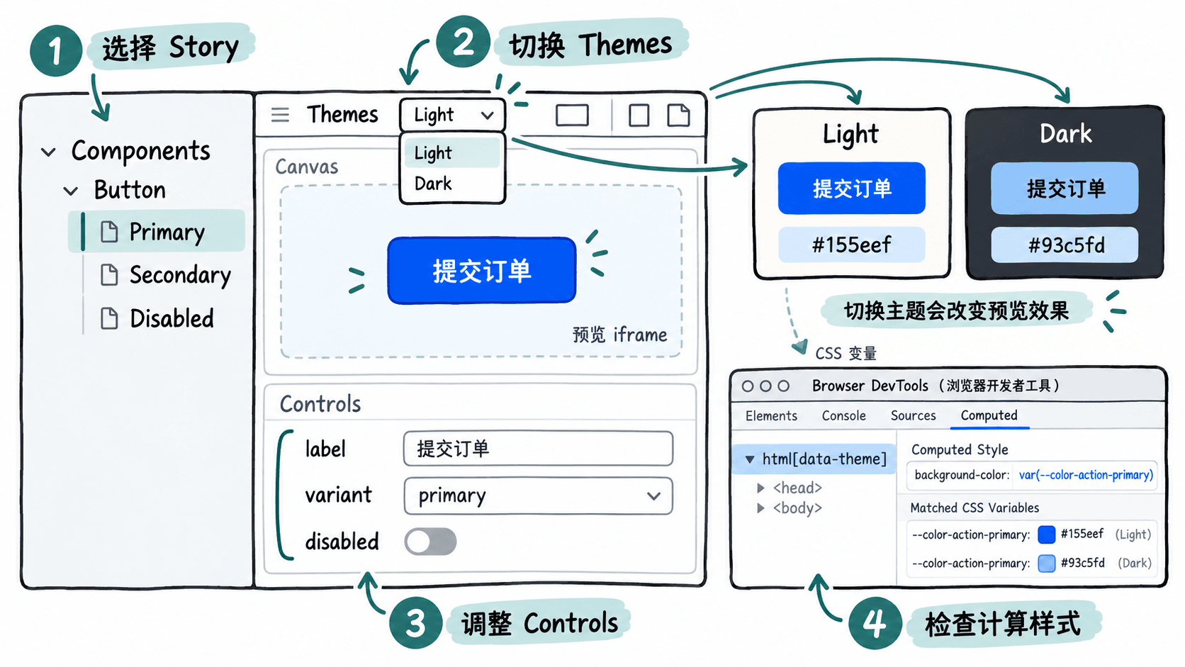
按照本示例,六个固定验收组合的按钮背景色应为:
| Story | Light 背景 | Dark 背景 |
|---|---|---|
| Primary | #155eef |
#93c5fd |
| Secondary | #eef4ff |
#344054 |
| Disabled | #a3adc2 |
#475467 |
浏览器 Computed 面板可能以 RGB 显示颜色,例如 Dark Primary 为 rgb(147, 197, 253),与 #93c5fd 等价。还应检查文本可读性、禁用状态是否不可点击,以及浅色和深色表面是否同时更新。设计验收记录至少包含 Story 名称、主题、设计稿版本、实际与预期差异。
排查主题不生效的常见原因
如果工具栏已经切换,但按钮始终是浅色,优先检查三个具体位置:
- 属性位置不对:在浏览器开发者工具中进入 Canvas 的预览 iframe,确认其
html确实带有data-theme="dark";不要只查看 Storybook 外层页面。 - 样式未加载或被覆盖:确认
.storybook/preview.ts导入了tokens.css。检查 Computed 的background-color来源;若组件内仍有background: #155eef等固定色值,替换为var(--color-action-primary)。 - 变量名或作用域不一致:例如 CSS 写成
[data-mode='dark'],装饰器却设置data-theme,选择器就不会匹配。让attributeName、选择器和 Token 构建产物采用同一约定。
当三个 Story 在两种主题下都得到预期计算值,且设计稿差异已经记录,Storybook 便可作为设计师与开发者共用的主题验收入口。